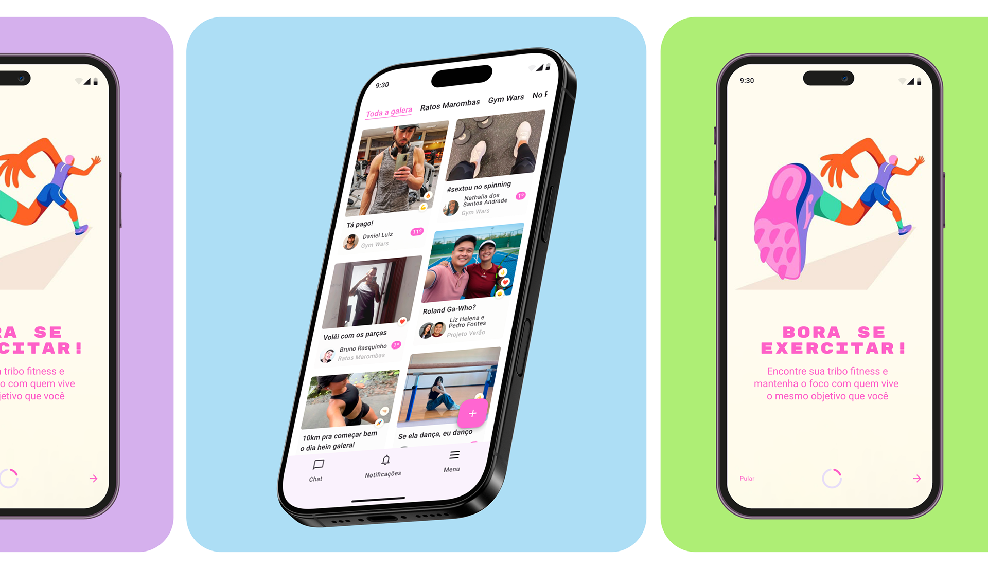
Gymrats é um aplicativo de fitness que permite aos usuários formar grupos e acompanhar seus exercícios por meio de um sistema de ranking baseado em pontos. Meu objetivo de estudo foi fazer uma revisão da interface e a usabilidade do app utilizando o Material Design 3, do Google, como referência.
PESQUISA QUANTITATIVA
Dores/Oportunidades
Os usuários gostam do aspecto social, de competição com os amigos, mas tem baixa frequência de interação através de comentários e reações de emoji. Foi pensado maneiras de aumentar essa adesão.
Em pergunta aberta dentro da pesquisa quanti, uma sugestão de usuário apresentou uma possibilidade interessante de feature que aumentaria o aspecto colaborativo do app.
"seria legal se pudessemos fazer check ins colaborativos. Por exemplo, malhei com um amigo, e [...] os dois marcam pontos"
Pontos positivos
A pesquisa quanti deixou claro que o user flow de registro de atividade não era uma dor do usuário, então isso foi mantido
**COLOCAR VIDEO** do protótipo funcionando
Abaixo, é possível ver o antes e o depois.
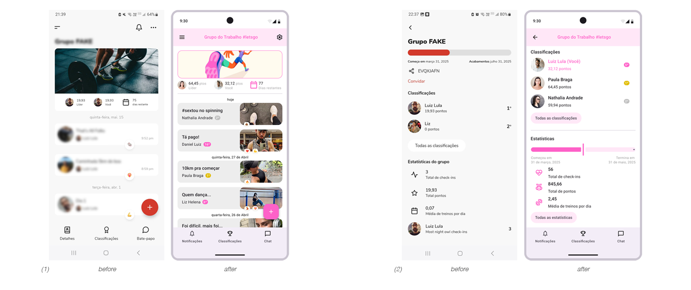
Na página principal do grupo (1), as fotos tiradas durante cada check-in (o envio de foto é obrigatório no app ao registrar uma atividade) aparecem em tamanho maior para destacar o aspecto social do aplicativo. Além disso, um selo indica a colocação de cada usuário no ranking, incentivando a competitividade.
Na página de Ranking (2), as informações mais importantes aparecem primeiro: sua posição atual na competição, seguida pelo ranking completo. Em seguida, são exibidas estatísticas gerais do grupo. Ambas as seções incluem um botão para acessar informações mais detalhadas.
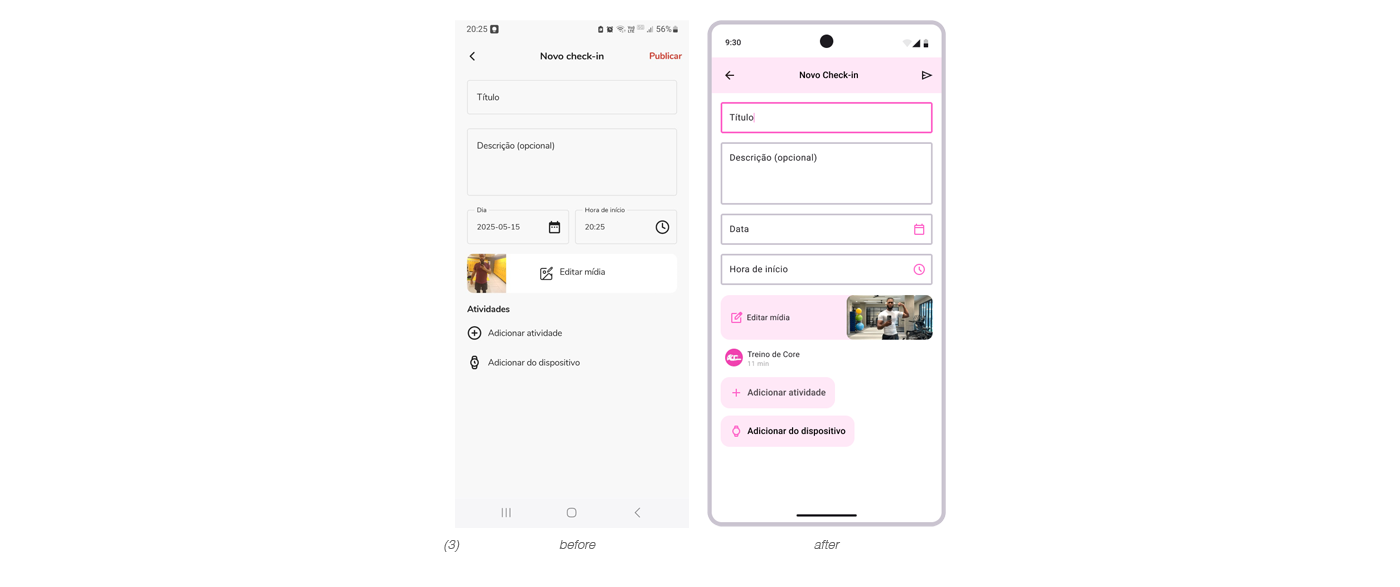
Na nova página de check-in (3), os campos de texto foram reorganizados para criar um layout mais contínuo, e os botões foram destacados para garantir melhor visibilidade.
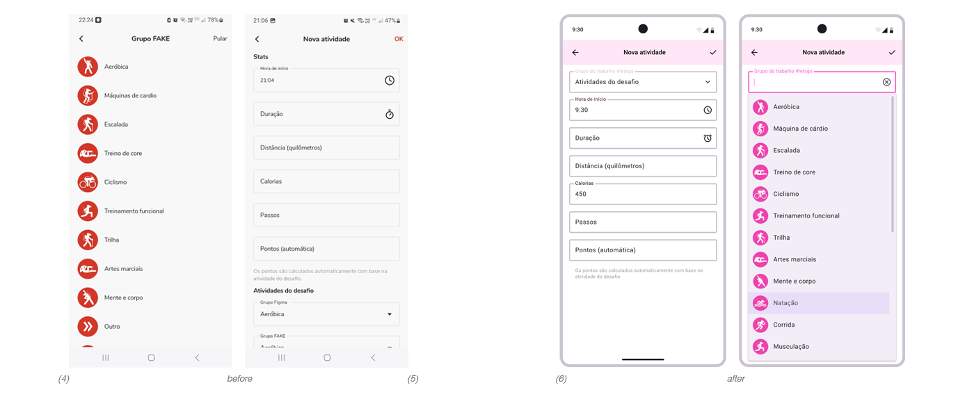
Na nova página de atividade, melhorei a experiência do usuário ao reduzir o número de etapas necessárias para registrar uma atividade. Antes, era preciso primeiro escolher a atividade (4) e, em seguida, ir para a página de nova atividade (5). Após o redesign, todo o processo acontece em uma única página (6), com um menu suspenso para a seleção da atividade.
USERFLOW